
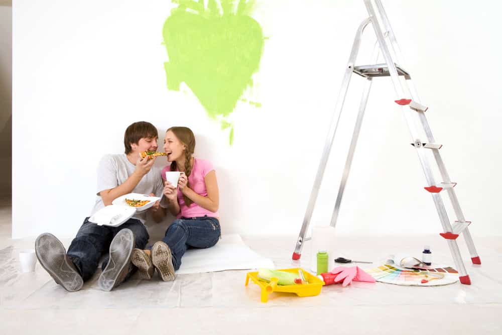
Food-inspired colours are on the rise following Pantone’s colour of the year announcement, ‘Mocha Mousse’, which has peaked at 1.2 million searches according to Glimpse.
This has sparked a popularity of colour searches deriving from all things edible, encouraging a 91% growth and 313K searches in the past month for ‘butter yellow’.
Interior design specialist Melissa Denham from Hammonds Furniture and Sam Grieg, Head of Design at Swoon explain why colours such as ‘butter yellow’, ‘mocha mousse’ and ‘mint green’ are trending and how to effectively use these in your home’s design.
What is ‘Foodication of colour’ in interior design and why is it used?
“Foodication of colour in interior design isn’t a widely recognised term (yet!), however, it’s an emerging concept, referring to how food-inspired colours are used in interior spaces to evoke emotion, comfort, or even appetite.”
“There are many reasons these types of names for colours can be used. Firstly, food is both familiar and relatable. By naming something ‘butter yellow’ you instantly can picture the light creamy yellow shade, without even needing to see it.”
“In addition, colour names can evoke an emotional response, which is great for when you’re aiming to mimic a certain feeling within a room. For example, hearing ‘mocha mousse’ you imagine a moody, yet sophisticated vibe compared to ‘bubble-gum pink’ which has a playful and feminine feel.”
“A great way to add a playful food-inspired pop of colour into your home is through furniture, whether that be through a stand-alone piece or through the introduction using fitted furniture for your accent.”
7 trending food colours and how to use them in your home
- Butter yellow
“Butter yellow is a low to medium colour saturation of the primary colour yellow. Its mellow and creamy nature sits somewhere between a pastel yellow and a light golden yellow – think of a softened butter.”
“If you’re looking for a space that looks warm, soft and inviting – go for butter yellow. “

“Best used in living rooms you can go for big ticket items such as sofas or dining chairs as the colour won’t feel overpowering. It’s perfect for helping to curate either a cottage-style décor or a vintage 70’s feel.”
- Mocha mousse
“As Pantone’s colour of the year 2025, mocha mousse is described as a warming brown hue imbued with richness.”
“Belonging within the neutral colour category, mocha mousse can be used as both a feature colour, or a base for an entire room. Inspired by a blend of coffee and chocolate tones, it’s both deep yet muted.”
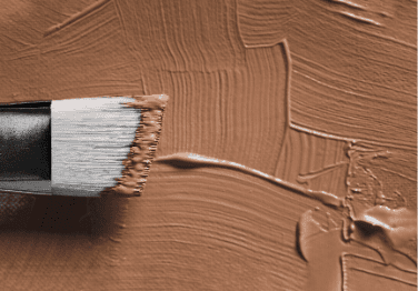
“Perfect for any room, however, in a bedroom it will create a sophisticated and chic interior, particularly when paired with a minimalist design. Consider a mocha mousse headboard which perfectly combines with bedding colours such as cream and dusty rose.”
- Mint Green
Sam Greig, Head of Design at Swoon commented:
“If you’re wanting a subtle splash of colour, a lighter shade like mint green is a popular choice. Mint is a restful yet energetic shade for decorating, it brings a refreshing feel to any space and adapts beautifully depending on the colours you pair it with. It can be partnered with other pale hues and pastel colours for a soft, feminine feel, or dark hues such as brown or burgundy for a starker contrast.
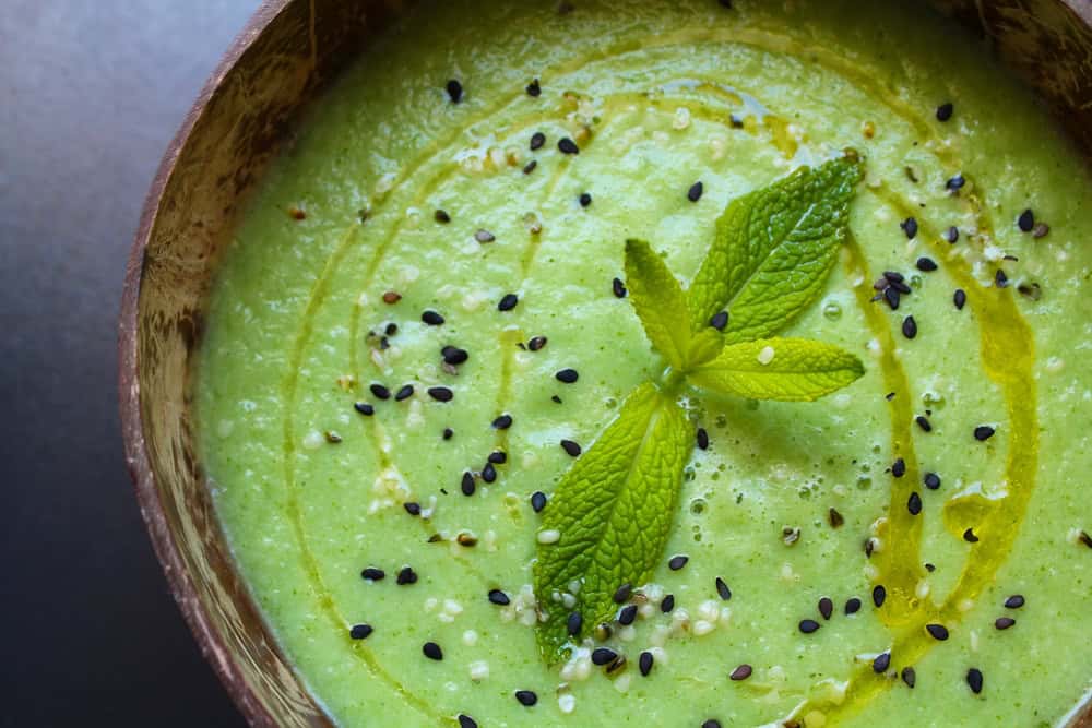
“Go for a single statement piece or carefully weave into patterns for a more subtle nod, for example in cushions, wallpaper or curtains.”
- Tomato red
“Tomato red is bold and refreshing tone of red that mimics the colour of a perfectly ripe tomato. It’s ever-so slightly orange hue and high saturation means it’s a warm toned red, opposed to a cool toned red like cherry red.”

“Due to its organic feel, used for tiled backsplashes or flooring adds a Mediterranean vibe in your home. Tomato red artwork is also a great way to add a bright and inviting focal point into a room.””
- Olive green
“For the fans of earthy colours, olive green has an effortlessly cool effect. Its muted and slightly dull undertones mean it’s often viewed as more of a neutral colour, despite being a shade of green.”

“From accent walls to furniture, you really can’t go wrong with olive green. It works particularly well when paired with the colour black or natural materials such as wood, wicker and marble.”
- Bubble-gum pink
“Bubble-gum pink oozes fun and femininity. Associated with sweets, it’s a bright and highly saturated colour with a strong cool undertone.”
“Perfect for a child’s room as an accent colour in soft furnishings such as curtains, rugs, bedding and throw pillows. Despite its youthful connotations, the colour is ideal for anyone looking to create a retro or Y2K aesthetic with the colour having the famous association to Barbie from the 1960’s all the way into the 2000’s.”
- Blueberry milkshake
“Belonging to the pastel colour family, blueberry milkshake is a mix of blue, purple and cream, resulting in a milky shade.”
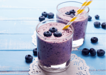
“If you want your home to feel friendly and whimsical, this shade can offer you that. The soft appearance of blueberry milkshake is perfect for small spaces, such as bathrooms or utility rooms, working perfectly with gold or brass accents.”
“For an elevated feel, use as a brightening pop of colour within neutral grey or cream rooms, giving it a scandi-inspired feel.”
So whether you’re into creamy pastels or bold berry hues, there’s never been a tastier time to give your home a flavourful refresh.


